
An ongoing joke at home is that after plotting roast curves, running a coffee business is mostly worrying about bags. What are they made of? How many are in stock and what’s the lead time? 8oz! 12oz! Inset zippers, block bottoms and side gussets!?! The current bag related quagmire is the design choices for the 2.0 Quietly bag.
I do like our current bags but they were the product of tight timelines and not knowing the minutia of workflow (folding that tin-tie is tough after awhile). Moreover, I never want to be in a comfort zone at Quietly because that suggests resolution to the myriad of problems on coffee’s environmental, social, political, and economic fronts. I always try to listen to that inner-teenage voice of dissent that loves to call me a sell-out.

I am not alone in rebranding. A quick scroll through Instagram reveals a lot of fresh looks at big companies, like Onyx, Huckberry (now Huck) or Toby’s (now Partner’s). Running parallel to these creative re-inventions are brand new companies forging their own outward aesthetic identities. To single out my current favourite, Harken in Vancouver launched this year with stunningly sleek boxes (containing delicious beans thanks to their wonderful head roaster Stacey Lynden). I present this brief litany with purpose, as I want to examine the connective thread or collective motivation behind this recent trend.
The last Ask Lee dispatch alluded to the fact that minimalism appears to reign supreme in coffee right now. Shops, bags, and branding are all embracing simplicity (at its best) and austereness (at its worse).Given it is an aesthetic inclination that extends far beyond the coffee landscape, the fad is unsurprising. In recent years, the term ‘minimalism’ increasingly operates as a signifier of tiny homes or battles against closet clutter but I want to narrow in on minimalism as a design choice – think plain album art, stripped down website landing pages, pared down computer icons, or bland interior design (always with that white sofa).


In coffee, this aesthetic comes across in two main ways. First by way of form, which would be the actual lines, shapes, and colours of the bags with simple palettes, clean outlines, and inelaborate designs. Second it operates in the content, which is the type and amount of information included on labels or stickers. Here are a couple of examples of those larger companies embracing minimalism through their rebrands:


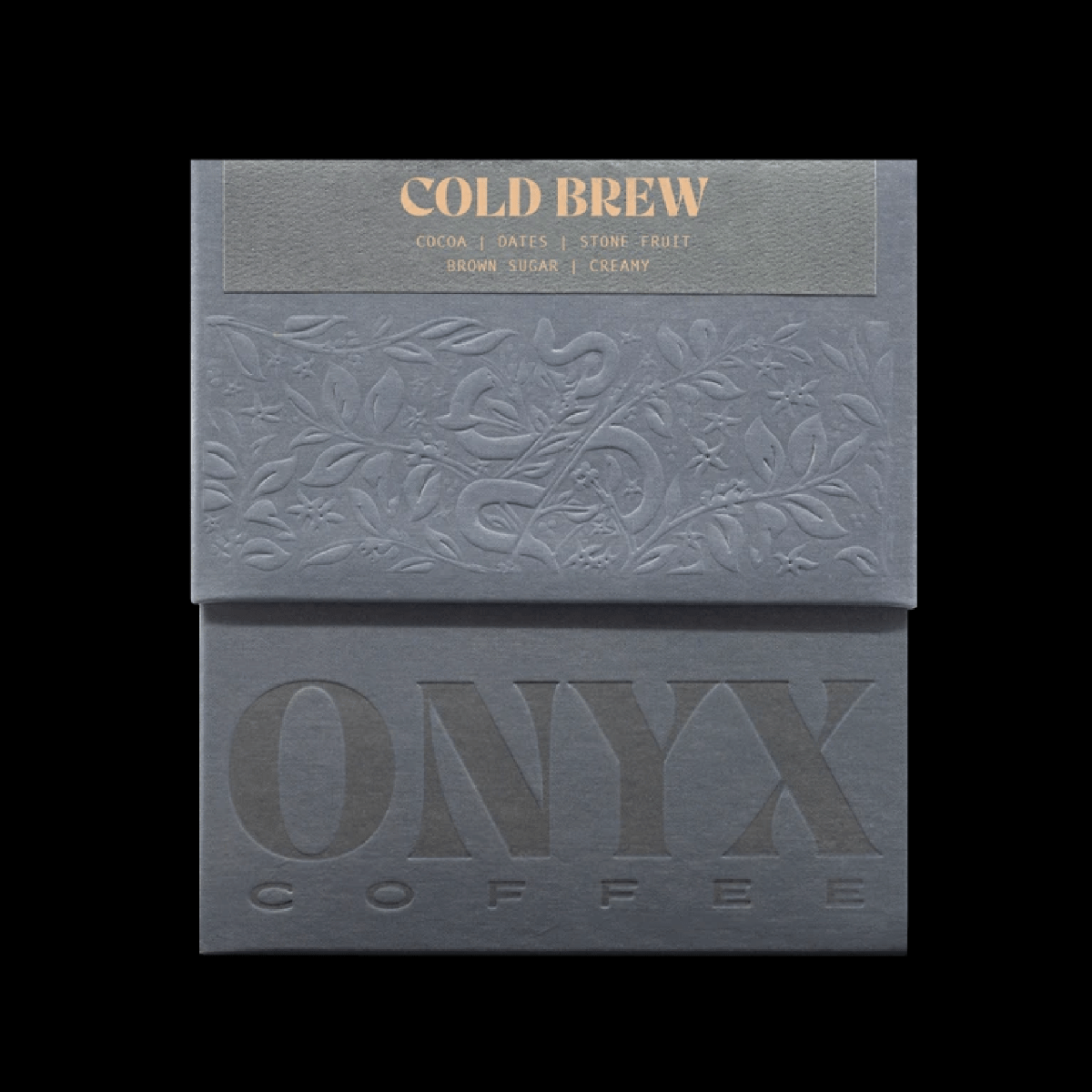
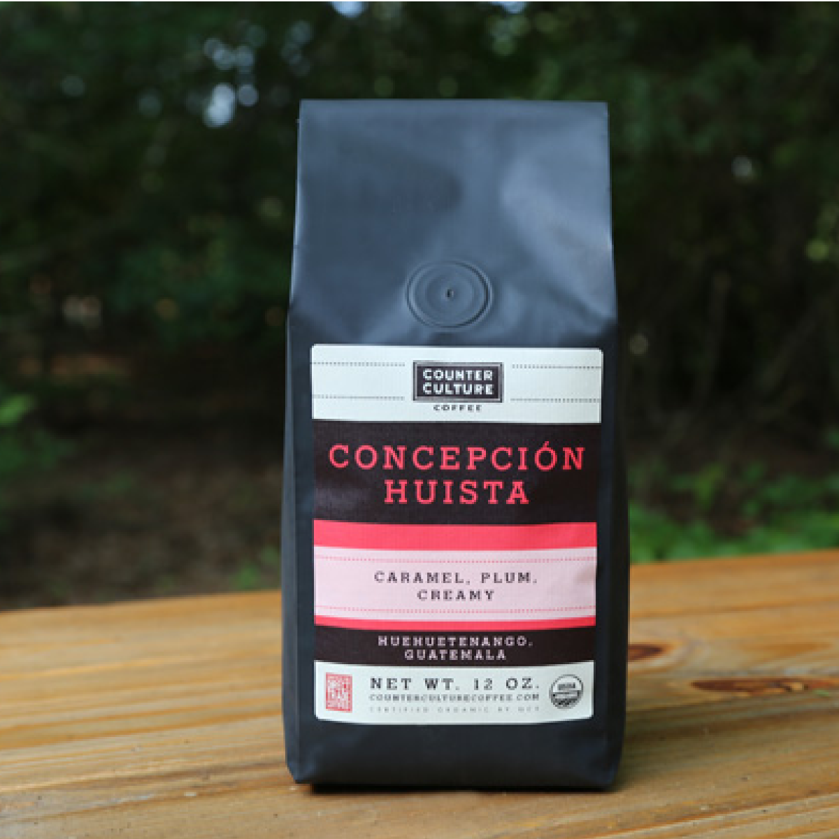
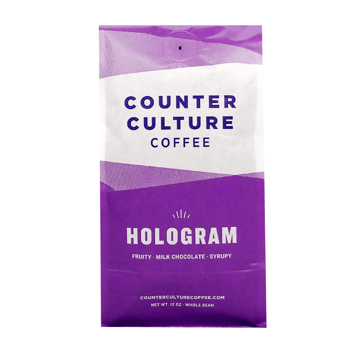
On the left you see the old, on the right is the new for Intelligentsia, Onyx and Counter Culture. You will notice a streamlining of the formal visual elements: less patterns, fewer textures, and an overall reduction in design elements. In tandem, much of the content disappears. On intelligentsia, gone is the paragraph description and their brand name. On Onyx, the elevation, varietal, roast degree bar, and brand anchors of ‘coffee lab, est 2012, hand crafted, small batch’ all vanish. In its early iteration, the Counter Culture bags list country, department and municipality with ‘Guatemala’, ‘Huehuetenango’, and ‘Concepción Huista’, which are lost to the more brand specific names like Hologram, Gradient, Forty-Six or Apollo.
In case it is unclear, I am not charting these with any sense of evaluation or judgement but rather attempting to illuminate a core industry shift, in order to ask: what does it all mean? However, I am also purposeful in my selection here, as these are all companies who were critical in shaping the industry. Along with numerous others like Blue Bottle or Stumptown, this group inherited all those La Marzocco’s from the increasingly automated Starbucks and churned the turbulent waters of the third wave. And salient to this conversation, they battled for more – not less – origin information and transparency.

I know, I know, we have done the first, second, third wave history many times here but there is a take-away when it comes to this encroaching minimalism. Starbucks and other second wave mainstays centered product and customer experience inward, towards the companies themselves. It was not about origin but rather roast degrees (French, Vienna, and so on); it was not about producers but instead individual drink specifics (syrups, foams, ratios, and so on). The power of third wave is the connection between sensory experience and sourcing; it imbues meaning and value to the cup. Moreover, such traceability comes in tandem with higher quality (on multiple fronts, including roasting technique and brewing extractions) so the excitement and novelty of the unique to take center stage.
However, such highly focused attention on ‘the story behind the cup’ fades as the wave moves ashore. In these few examples, we have a reduction in both form and content. It makes sense though, as its not so much the wave receding but rather spreading: the market expands and there are an ever increasing number of roasters pulling from the same set of importers and offering very similar roast profiles. Slick, eye-grabbing packaging becomes an easy and effective way to differentiate and identity build. What started as reflections on origin regress or shifts backwards to the more insular and inward refraction: companies strip everything away except their increasingly simple and abstracted brand image.

To grapple with the tough ‘what does all this minimalism mean’ query, allow me to crib from Wilhelm Worringer’s Abstraction and Empathy. Originally published in 1907, it explores the then modern aesthetics of abstraction. For Worringer, empathy drives representative art or works that recreate scenes, objects, or people from the world. Say I want to paint a portrait of my dog or do a landscape of the meadow behind my house, I connect to Hazel by replicating her golden hair through brushstrokes or relate to those wild flowers by attempting to capture the patterned sunlight on their petals. The act of copying makes me empathic. As he writes, “we are delivered from our individual being as long as we are absorbed into an external object, an external form”. But what about works that don’t crib from reality, for example, a child’s wild scribbles?
Worringer suggests that it is our energy and impulses that drive such an ‘urge to abstraction‘. Counterbalanced to our empathic desire, we have a “psychic presupposition for abstraction”. It motivates us to turn away from the world and towards frantic lines, loose burst of colours, impressionistic voids and alien shapes. He argues that there is a pleasure in adding to the world – to increasing its aesthetic objects and weaving new threads into reality. However abstraction’s thickest roots are in our insecurity, which he describes as a collective “immense spiritual dread” due to our unknown place in the universe.
Our metaphysical pull to abstraction arises from feelings of “flux” and “bewildered“. One example he employs is the pyramids; in an attempt to grapple with the senselessness of death, these memorials employ a stark geometric shape that is far removed from the actual square box of a coffin, which sits in the equally square floorplan of a tomb. The triangle is antithetical to the human faces and scenes carved onto a sarcophagus. We cannot empathically connect to death because it is forever beyond us (the act of imagining death runs counter to the state itself). Thus, we battle our existential dread by fixing and shaping it into a massively powerful abstract object. The pyramids become a transcendental assurance or affirmation against our deep seated trepidation and terror.

So art, pyramids, dog portraiture: how does this all connect? In my examples above, third wave roasters drift away from traceability with decreasing details in both form and content. The movement is towards a more introverted minimalism; the world of origin fades away as we escape into the abstract. And I want to suggest that it is a dangerous pivot because we lose that sense of empathy identified by Worringer.
Imagine this: you are brewing at home and your first sip is full of sticky stone fruit, bright effervescent lime, and a lush toffee finish. Astonished you grab the bag and attempt to understand why this cup is just so sweet, juicy and clean. Here the story splits into two alternate endings: in one, you find out about the people who grew, harvested, and processed the coffee and connect in what Worringer calls “appreciative activity”. Your life overlaps and you “expand your inner vision” by understanding that coffee is the product of labour, that the taste exists because of farm-level choices and that you are experiencing the unique story of a specific place and time. It is an act of empathy. In the second ending, the answers to your curiosity are truncated on a polished but extraordinarily minimal box that only points to a brand name and prescriptive taste notes…
I am leaning to Worringer with cause, as so much of life right now is dread and insecurity. The third wave was supposed to fix all the problems entrenched in coffee. The idea was balance replaces inequality, specialty disrupts commodity, camaraderie succeeds exploitation, and we repair the broken links in the chain. But it never happened. The economic, social, and political crises persist and I think so much of our coffee minimalism speaks to a large urge: to escape discomfort, to ignore inequality, and to push away responsibility. Its a new version of trying to turn death into a pyramid.
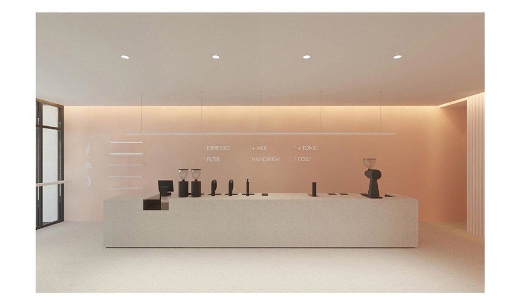

These two images above are from a new shop in Chicago and while it is stunningly beautiful, I do not see how the space fosters conversations about producers. While I am not advocating for jute bags on the wall in some form of a coffee-themed coffee shop, I am just wondering how we can align our political goals with our aesthetic sensibilities.
I wanted the Quietly 2.0 bags to have some sort of grounding in the plant that makes coffee possible because it opens the window to origin, to the labour behind the cup, and to the people that make coffee possible. In Worringer’s terms, I am trying to situate Quietly at the representative pole. A simple sip can transport us and illuminate the literal value of coffee. It seems only right to use both the form and content of our bags to “deliver ourselves from our individual being” rather than turning inward and stripping away everything but the self, or in this case, the brand. Against minimalism, lets strive for more spaces, more voices, and more empathy. Or, at least recognize that aesthetics are always political.
💓✨☕🙏
Trust the Process,
Lee Knuttila

