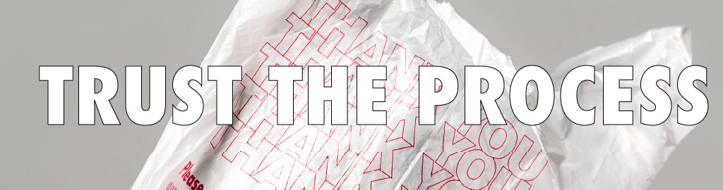
Quietly turned five this Spring, which is hard to believe! It is one of those spans that seems paradoxically too long and too short to be true. When we packed up our Parkdale apartment and headed to the countryside, I had a pretty keen sense of the taste profiles and roasting approach for Quietly, but lacked a sense of our look or branding. While some elements of Quietly have remained constant, our bags continue to change. By virtue of being single use, bags raise a multitude of ethical and environmental questions. Plus, they are a key part in the communication of information when it comes to a coffee’s origin and the details of a farm.
With year five, we have our fifth bag! And I have received several messages about them, so to prevent my inbox from filling up, here is some answers to frequently asked questions!

Turns out we are worse than Loblaws! I received several strongly worded messages about our choice to move from 340grams to 300grams. It would have been nice to have this written prior, but we are a very small operation and the day-to-day is frantic. So better late than never: why the shrinkflation?!?
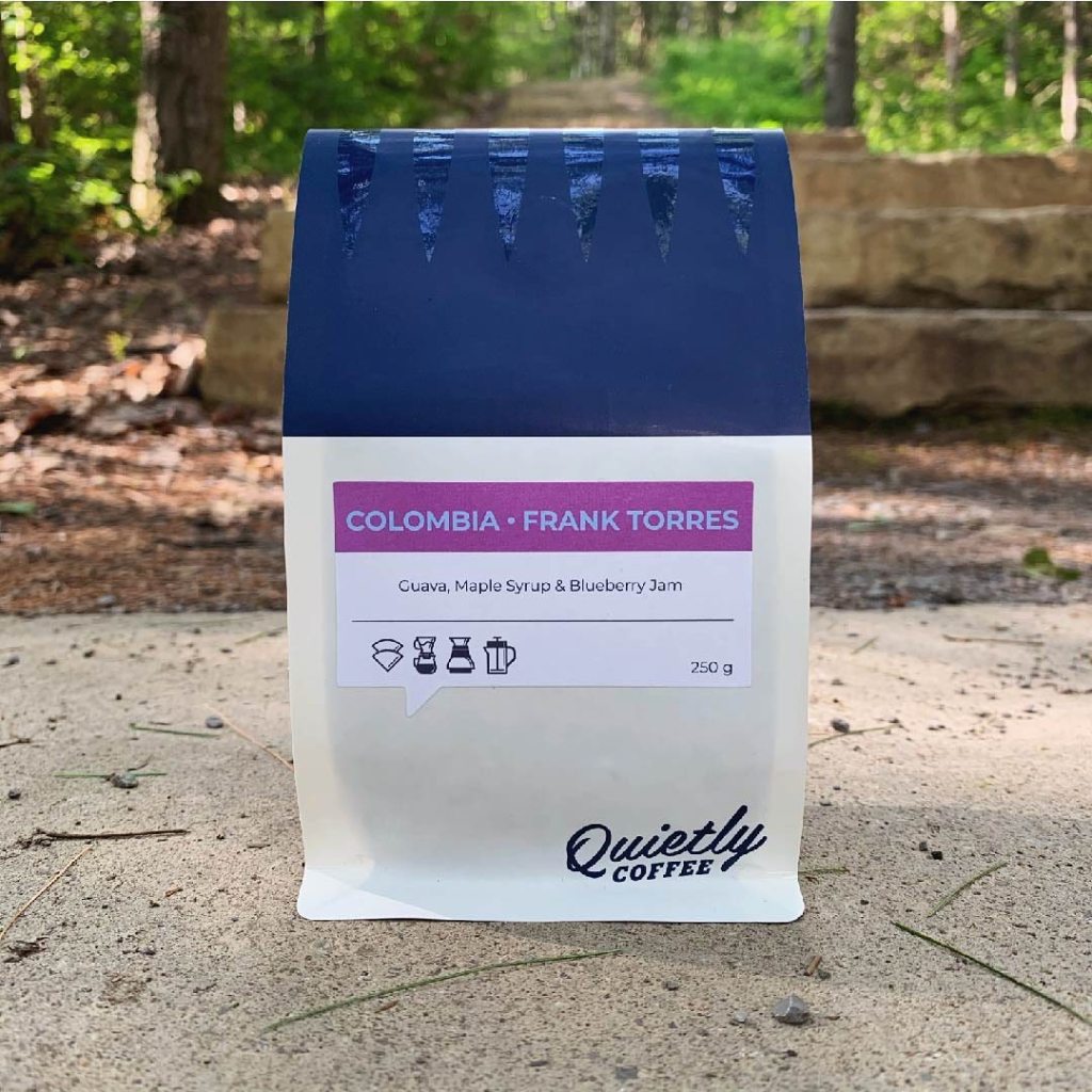
We focus most of our energy on partnering with shops and cafes rather than selling direct to customers. It has always been my preference because the shop level excels at communicating the story of the cup. It becomes an avenue to learn about the producers and labour of coffee through the sensory experience. Originally we started with a 250 gram bag for filter and a 340g bag for espresso. Later we upsized everything to 340 gram bags. However, since making that change, numerous accounts have requested a return to smaller bags. Why, you might ask?
In Europe, I would be hard pressed to name a specialty roaster who deviates from the 250g size. Similarly, other global hubs for specialty, like Australia and New Zealand, heavily rely on the 250g bag. However, the market is slightly murkier in Canada. On one hand, there is still a large market share of established roasters who tend towards darker roasts in large format bags. On the other hand, we conducted a review of all the newer and more light roast focused roasters in Canada and the clear baseline amongst them is 250g.
I personally love the 340g size for the bag-to-waste ratio and it provides a healthy number of brews per week. The issue is: when we bring in green coffee at a high price point to sell in a 340g bag, while other roasters sell similar coffee in 250g bag, their price appears significantly lower on the shelf. Accordingly, ours is skipped over because most customers do not notice the weight difference. Hence, we have requests at shop level to drop down in weight and by extension price.
A couple of other notes to respond to rude emails: Yes the bag is smaller, but also yes, we lowered the prices on both our website and for wholesale accounts. Our prices are still in line with where they have always been, which is based on the quality of green coffee that we buy. And, no, I am not trying to sneak the change into a social media post about our new look, I wanted to fully explain the rationale, hence this post. Lastly, we went 300g because – I agree – 250g is not enough coffee!
There has been a lot of virtual ink dedicated to the challenge in finding an environmentally friendly material for bags. While there is no shortage of companies flooding my inbox with their claims for fully compostable or recyclable bags, it is all highly dubious.
Rather than fully going through the terrain covered by ‘Bags: A Ghost Story‘ on greenwashing, we once again checked in with the compost guidelines in every major Canadian city and they do not want any bioplastics. The company Grounded, for example, has a ‘plant based’ option made of Polyhydroxyalkanoates (PHA), which do break down in industrial settings, but akin to a starch based or cellulose based products, cities like Toronto do not accept them. Yes, it is an industrial composting system but its purpose is to create nutrition for soil. Compost is not simply a catch-all for trash. To quote the guidelines, the process of composting “was not designed to process packaging”. In other words, treating compost like garbage is counterproductive to the very purpose of the organics waste stream. A lesson which I also learned while testing bags in my backyard, where they ended up as large nutrition-less chunks in my home bin…
So what about recycling? You might be familiar with an increasing number of companies using the stand-up pouches with the chasing arrows (aka the mobius loop of arrows that form a triangle). I am going to try to not get too deep into details but the rates of actual uptake are depressing. CBC’s Marketplace did a good story detailing how we have made private “recycling” companies so integral in our municipal systems that most recycling ends up in landfills, is shipped overseas, or is even burnt (more here, here, and here). Some optimistic studies put the reuse percentage of blue bin items as high as 30%, while others mark it as low as 6%. One core issue is the sorting process. Adding plastic films or layers, like a sticker about a coffee origin, means it will be diverted. So unless you are buying an unmarked bag, it does not really work for coffee…
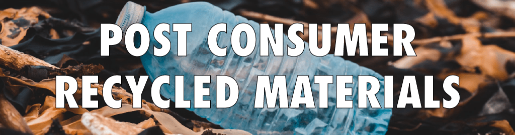
So, the best of the current options for Quietly this time around was to seek out post consumer recycled materials. These are ‘end of life’ materials destined for landfills, think plastic bottles or food containers. It partially alleviates the frequent use of virgin materials in packaging and also follows through on the ‘using waste for waste’ logic. Of course, many companies offered 100% PCR, which does not actually make sense given the layers required for a food friendly bag. So we ended up going with TricorBraun because they happily offered their internal and external audit information and could do a thin bag, meaning less materials overall. So, its okay! Not great, but okay!
One last note on the bag composition; we identified the three materials that are used in the making of our new bags. They are indicated by the triangle symbols on the bottom of the bag (versus the arrows). Having read through articles like, “Consultation paper: Towards Canada-wide rules to strengthen recycling and composting of plastics through accurate labelling”, we should all be very wary of companies who continue to employ the chasing arrows symbol, especially without any material information (full read is here).
As mentioned, when we started Quietly, I had a keen sense of the kind of coffee that I wanted to source and my personal approach to roasting. But what should it look like? The idea is that a well roasted cup of coffee tells a complex story about its origin without words. The sensory experience itself reveals the labour and choices made at every step of growing, picking, processing, drying, and roasting. When we launched, money was tight so we just used some stock bags like so:

From there, dear friend of Quietly, Marcus Nilsson, was kind enough to design our first branded bags. He asked me about inspirations and approach. I tread a lot of nostalgic territory about my grandparents and their love of coffee. Voila, a bag that riffed on the Scandinavian kettles that one might find in Rocanville aka ‘New Finland’ Saskatchewan:
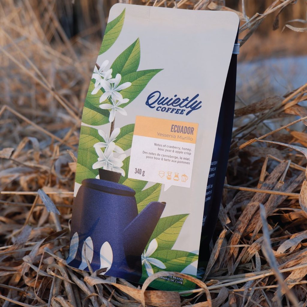
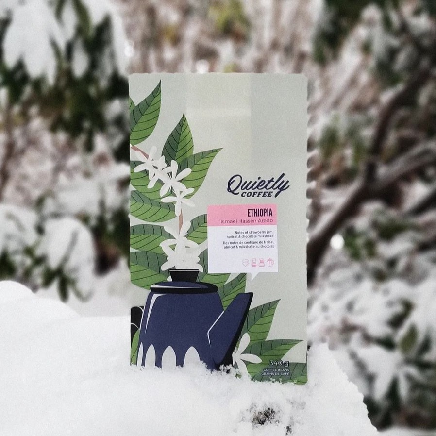
It was nice to have something with more personality than stock bags but I knew they could shift towards something more complex and closer to the Quietly identity. So when our stock went low, I sketched up a crude drawing with our familar kettle alongside a coffee plant in bloom. The idea was to visually reinforce this connection between the people and places that grow coffee, our roasting approach, and the resulting sensory story. Hence, the coffee plant, our kettle, and the word bubble:
Again, I don’t want to tread too much on previously explored territory but we ended up shifting materials for the sake of doing away with bioplastics but it also required a big reduction in details. The illustration was still nice but did lose some luster and personality as seen here:
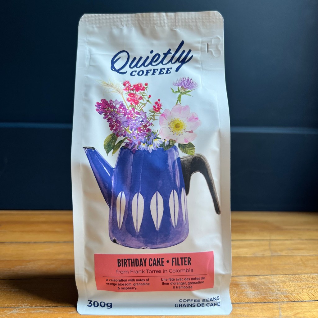
As our bag stock dwindled, I again drew up a crude sketch of the kettle, this time filled with the Ontario flowers that I see on my daily dog walks. For the type of soft feel that really is at the heart of Quietly. For a less ‘coffee themed coffee bag’ and more about the entire Quietly project: partnering with producers harvest-after-harvest is akin to perennial flowers coming back every spring. And I always will roast in a personal and intentional way, the same way my Grandmother brewed a cup every morning. So I sent a rather rough sketch to my supremely talented friend, artist Melinda Josie (see her amazing work: here) and she produced exactly what I was struggling to articulate:
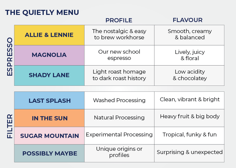
The redesign also allowed me to make some key changes to the packaging that I think were weak. The biggest complaints I receive (besides being worse than Galen Weston) were from people trying to pull shots with a coffee from our filter menu, or they were trying to do a filter brew with Allie & Lennie or Shady Lane. The roast degrees on our menu are not that significant but you will get a much better capp with a coffee profiled for that approach. Similarly, a pour-over will be much more vivid, lively, and complex with a filter specific offering. When we started I used Allie & Lennie, Magnolia, and Shady Lane as categories for ease of identification at the cafe level. You can always use a pretty similar set of parameters for each coffee. However, I always just went with producer names and countries for our filter menu.
We did identify our brew suggestions through a set of beautiful but way too subtle icons. I still love them but realized there is already a slew of information on the bag. Plus, when our bags sit beside other coffee bags that do not employ a similar iconography, things get muddy. So on the new bags, we went for big and bold FILTER or ESPRESSO. Similarly, I realized that the ‘named guides’ were more useful at the customer level than I would have guessed. So we now have similar categories (with fun names!) for our Filter menu to help with clarity in a world full of barriers:
And yes, they are all references to music. My roasting style is always influenced by the art that inspires and makes the everyday delightful! So with all of this said, we have a new look but it is drawn from lessons of the old. We continue to be a little, tiny, and precarious coffee experiment in the Ontario countryside – but I am reassured by the fact that with each change and small evolution, things continue to feel more and more like the Quietly I envisioned five years ago.